'Interaction design' is one of those newish buzzwords that has become strongly tied into the UX design process. In 2015 it's no longer enough for interface elements to instantly switch between two static states. Today words like 'slide' and 'bounce' and 'rebound' have come into the conversation on how good user interfaces work.
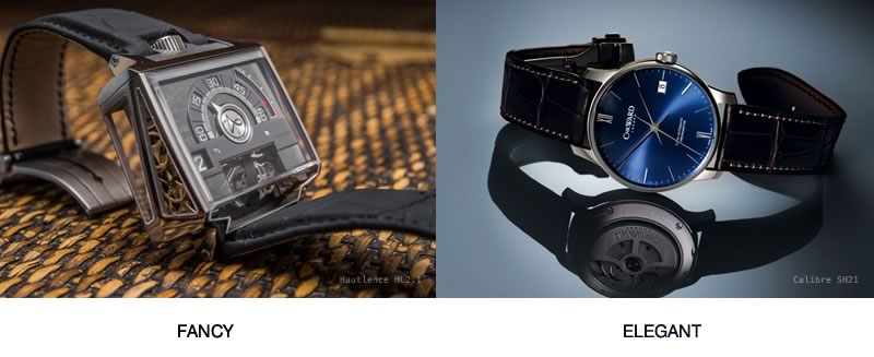
However in the world of interactions – as is the case with expensive watches – 'fancy' does not not necessarily mean 'elegant'. While we may be curious about the complexity of the fancy watch below, I suspect that very few of us would want to actually wear it. Natural elegance almost always triumphs over decoration in our interface design too.
If you are creative like me, it's easy to be tempted to create fancy-flying interactions just to make your website feel more modern and engaging. Of course, in our hearts we know this approach can be one of the surest ways to screw up your entire user experience.
As such, I've found that it's important to focus on animations that are so smooth and easy on the eye that our users barely notices them. That's when our animations move out of the spotlight and instead support our what our user is trying to do.
So, why does that matter?
Why does Apple spend so much time and money on packaging that usually gets quickly thrown into the recycling bin? Why do luxury car companies tune the sound of their doors closing?
It's because we find that minor, seemingly unimportant details can have an disproportionate impact on great design, and can lift a UX from "fine" to "awesome".
Enriching your website with beautifully designed 'micro-interactions' not only makes it more usable, but can also trigger positive emotional feelings in your users (like opening that Apple box). Experiencing such emotions means more dopamine is consumed and this literally helps them to become more addicted to your website/application.
So, what defines a 'micro-interaction'?
When a user makes an input (e.g. clicks, drags, types something) your website reacts - well, that's an interaction. This is a way for users to communicate with your website, so it's part of a dialogue. When designing a flow of how users behave on your website, you always have a few different types of interaction you can use:
- Navigation interactions: This is when a user ends up in a totally new page/state.
- Modal interactions: This is when the current state of website is frozen and some temporary state is displayed on top of it (e.g. "lightbox" gallery or confirmation dialog.)
- Micro-interactions: This is when you want only a single element within a page to react to user input – for instance, to show a drop-down menu or reveal more details of a product.
How do we make these reactions elegant?
A website should feel like a concert of interactive interface elements working together to impress you. Elegance is the key criteria to make such impression. Though it's very hard to define elegance in purely technical terms, we can use some logic hacks that helps us to create elegant interactions.
Key Rule #1 - No teleportation
The idea is simple - always use a transition when you are changing an element on page. That means there shouldn't be any instant snap-cuts on your GUI. Every appearing, disappearing or transforming element should be implemented with easing or/and animation.
This helps users to focus their vision on the areas you want them to. And of course this creates a feeling of elegance and consistent flow.
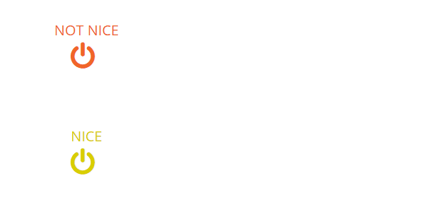
Rule #2: Toggles are better than buttons
At home you would usually use the same switch to turn lights both on and off. The same concept applies to toggle controls on your site. If a control toggle triggers a new state of a given element - that same control should rollback that state.
Furthermore, according to Fitts' law such controls should require close to zero effort to rapidly switch between on and off states.
Rule #3: Triggers should be nearby
Transitions always need some kind of trigger. At the time of the interaction, our user is usually focused on that trigger element. This means it's necessary that the transition begins on or very near the trigger. If you start a transition too far away from your trigger element, user could easily just miss it and the flow will break.
Furthermore a transition should generally propagate from the trigger to the position where you want to focus users' attention. The trick is simple - you lead users eye from trigger to the spot where he should make his next move. This way the user won't lose their focus and will be right on track where you want them.

Rule #4: Use natural transition timing
Transition timings define how long our animation is playing. The major problem with timing is that there is no magic wand to get it right. If you make your transition too long, it will create a pain point for users repeating the same interaction often or rapidly.
On the other hand, if it is too short it will feel unnatural – or the user may miss it entirely. Unfortunately, all you can do is to evaluate the transition by your eagle eye and gut feel. The best advice I've found is not to give all your transitions the same timing. Just play around and find the right balance. Also note that even a difference of 0.05s matters.

Continue reading %7 Simple Rules for Creating Elegant UI Interactions%


